Call Center KPI monitoring using Power BI
Coming from the Shared Services and Outsourcing sector, I saw how leadership values efficiency regardless of the industry (This is most likely because the sectors are billing its business counterparts/clients as third-party FTEs. I used to be in Oil & Gas and Tech-Consultancy industries.) Management puts great attention on the operations’ numbers starting from data collection up to reporting. Moreover, a greater pressure is placed especially when the numbers are being translated to insights and communicated to senior leadership. This is where the importance of good data visualization and storytelling enters as it is critical that your dashboard is well-presented and, at the same time, tells the story needed.
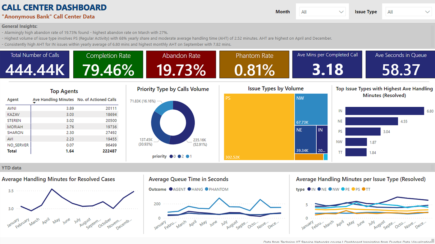
In this project, I created a KPI Monitoring dashboard in Power BI using call center data — the dataset and documentation can be found here. Below is a snip of the Power BI finished product but downloadable .pbix file of the sample dashboard can be viewed here, and an interactive published version of the dashboard here.
Sharing some personal guide in making this dashboard:
Slicers
- I frequently use slicers in dashboards so that the end users have autonomous control in navigating. The goal is to deploy tools that are user-friendly and are of self-service to my stakeholders.
Colors
- As much as possible, I refrain from loud colors. I either use full-white or dark gray as my background to keep a minimalist look.
- I utilize colors more as signals. For example, making use of the RAG colors (Red, Amber, Green) to signal the priority status. In here, completion rate is tagged as green or something we want to keep up, abandon rate is red or something we want to keep low, and phantom rate is amber or something that we can work on. Alternatively, you may also use the color in line with conditional formatting where the RAG colors would depend if the specific value/threshold is met.
Use of charts
- Before diving into the tool, it is important that you know what is the message that you want to convey so you can use the appropriate visual for it.
- In here, I made use of cards to emphasize important numbers to the audience.
- Tables can be used to provide the exact details as well as multiple information to be sorted.
- I normally am not fond of pie charts and donut charts unless if the number of items are less than five and its values are easily distinguishable.
- Tree maps are used to portray hierarchy.
- To compare average handling time of top issue types, I made use of bar charts. Instead of maintaining the x-axis for values, I used data labels for a cleaner look.
- When showing time-series data, make use of line charts in order to emphasize the trend or movement over time.
Insights
- In this dashboard, I made use of textbox to add general insights. When presenting to upper management, it will be easier for your audience to immediately know what are the highlights and callouts in your report such as metrics are not meeting target, spike in influx during last month of the quarter, etc. Keep in mind that these insights should only be a guide and be short.